Monday, 27 February 2017

Casting For Our Film


For casting we decided to use Rachael McAdams to play Walters wife, Nancy. She has played similar roles in the past that are set in the same timeframe as our film such as the notebook where she was a classic 1940s/50s wife.


We chose James Marsden to play Walters son, he has also played many main roles in romance films, there are lots of elements of emotions in our film and we felt he would be a good addition to our cast.


We chose Wes Anderson to be our director, our title sequence is heavily inspired by him and his use of warm/yellow colours and vintage, unique style.


Tom Hanks will be our main A list star, we chose him due to his huge success with films such as Forrest Gump along with many other successful, influential films in our genre.


Film Information

The budget for our film, Life Goes On, will be in the expected region of $80 million, this is also a similar budget of films that are closely related to ours. It will have a genre of a drama and the narrative will be a similar style to Forrest Gump, and a similar feel good factor to Goodwill Hunting. Our production company will be Paramount pictures whom will also distribute the film, this is to do with their vertical integration structure.
Life Goes On will be released in America first in the late weeks of November, this will ensure that our film will be in time for the Oscars in the following year and should avoid the clashing with christmas and fantasy films.


Pitch

We had to create a pitch for our film, it had to include the title of our film, narrative, film information, audience profile, cast and the pitch itself.


Sunday, 26 February 2017

Production Log 1


Filming Day 1
Camerawork
Weather 
Location 
10:00 to 10:40 am
Spin shot
Sunny 
Living room 
10:40 to 11:00 am
Close up of props
Sunny 
Living room (carpet)
11:00 to 11:30 am
Close up of Oliver 
Sunny
Living room (wallpaper)
11:30 am
Finish filming 


Although already filmed some test footage we started to film officially. We worked well as a group and all contributed in ideas. These are some stills of us filming our spin shot in the front room, we plan to edit the shot to incorporate the credits into the background.


Saturday, 25 February 2017

Testing Our ideas

Today me and my group filmed some shots for the title sequence. We made a few changes from the last time we filmed as we had to improvise, the birdseye view shot was more difficult than we originally anticipated so we had to experiment and do more of an trial and error method. 


In the stills above you can see me standing and kneeling on the table, Oliver could not film as he was in the shot. We added another light so instead of just having one, we had one on either side of the table this helped to try and even out the light and  decrease the shadowing, this improved the shot as the lighting made it brighter and the colours a lot more vibrant. The second shot we did was a pan over the items from the box as they are all laid on the table. This shot was not successful as we could not work out a method where the shot was not shaking, we tried to use a dolly however the shaking was still very noticeable so we will have to think of a way to reduce the shaking or a different shot and re-film this scene. We would then do several of these shots changing the props each time we pan across. 


Friday, 24 February 2017

Filming Location

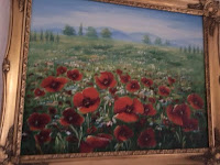
We decided our location should be at Laine's house as the colour scheme fits the idea of our title sequence. The yellow and warm tones with vintage patterns are very idealistic and work with our design ideas. We have all been looking for inspiration and how to incorporate our credits into the props and setting/background. Wes Anderson uses many of these aspects in his work and also uses a similar yellow, warm colour scheme like we plan to. There are many paintings similar to the one below in our chosen location, all with the vintage gold frame a plain background to draw attention and highlight the paintings more. We hope to take inspiration from this idea and try to re-create something similar for one of our shots.


Our Chosen Typography


We decided to use the font Shorelines for our title. We chose this because it represents our main character, Walter. The font is elegant and has associations with the timeframe our film is set in (1950's),  although the font is elegant and classy it is still however masculine when compared with Valledofas. We made a mutual decision as a group that we wanted a graceful and sophisticated font as it represents our genre better, opposed to a thriller which would have more of a bulky, bold font.


For our credits however we decide to use the font Morsal, this is because it is slightly easier to read than Shorelines and more convenient as the credits will appear for a shorter time than the title. Morsal also represents Walter very well as we wanted to create the idea that it is his writing, our overall title sequence is heavily designed to represent our characters strongly. The font has a very masculine feel to it and is a little bit messier and more like script, unlike Shorelines our chosen font for our title.


Wednesday, 22 February 2017

Typography Of Title Sequence


These are the possible fonts for our title sequence, we will need to decide as a group which font to use for our title and which on as our credits.

Production Call Sheet

We discussed roles as a group and logged the results on the Production Call Sheet.


Animatic Of Our Title Sequence


As a group we had to design an animatic of our title sequence to show what our title sequence is going to entail. It had to be similar to our real title sequence, so we used a similar soundtrack and drew pictures of the objects that will feature in our sequence. The length of the shots are also the same timeframe of the actual scenes in our title sequence.

Saturday, 4 February 2017

Todorov's Theory Of Narrative


Equilibrium- The film will begin with the main character, Walter Murphy, being visited by his son and grandchildren. The visit is in aid of Walter and his late wife, Catherine, 50th wedding anniversary.

Disruption- Walter’s grandchildren begin to ask questions about their grandma so he goes upstairs to get a photo album to show his grandchildren, whilst retrieving the photo album he comes across boxes of memorabilia, due to this Walter starts experiencing flash backs as the belongings he finds remind him of his past. 

Disequilibrium- He comes across his old army uniform and medals, this reminds him when he was sent away from whom he was loved by. The only company he had was his friend, Harry, who helped him through the war. Sadly one month before the war came to an end Harry was hit by a bomb along with three other men from their platoon. Other flashbacks include; when and how Walter met Catherine, their first date, their wedding day and honeymoon, the birth of their first child, Catherine's diagnosis and also the emotional day when Catherine passed away.

Repair- Whilst re-living moments of his past and reminiscing Walter has a chance to reflect and gain closure on his wife's death, he realises that they had an amazing life. His son and grandchildren are here to support him.

New Equilibrium- The film will end with Walter returning to the living room with the photo albums. Walter is grateful for the memories life he made with his wife, the film is symbolic of life and loss.


Thursday, 2 February 2017

Genre Sheet

As group we filled out this genre sheet as part of our planning for our title sequence.


Wednesday, 1 February 2017

Title Sequences In Our Chosen Genre

As a group we decided that the genre of our title sequence should be a drama.

The title sequence for Forrest Gump was designed by Nina Saxon. The title sequence starts with a white feather travelling across an American street, this shows the setting and allows a timeframe to be established due to the use of the style of cars and costumes, suggesting a timeframe of the 1980s. The feather used has many associations towards it such as flight, fate and freedom, these also relate to the themes explored throughout the film. The feather landing on Forest's feet creates narrative enigma as the audience would question why the feather was given such a significant scene, the use of camerawork also makes the experience more intense and highlights the value of the metaphorical associations towards the feather and its importance in the film. The close up of Forest's shoes draws focus to his trainers which are covered in mud with exceptionally white laces, the title sequence continues into the opening scene where forrest refers to his mothers saying of how you can always tell a lot about a person by there shoes, this relates to the narrative massively and will entice the viewer to keep watching in order to answer the questions that the title sequence has created. This also refers to the well known saying of not judging someone until you've lived a day in their shoes, this relates to the characters in the film, specifically Forest who was judged his whole younger life however went on to live an amazing one. The typography is very plain and simplistic, the white text blends in with the colour scheme of the title design, allowing the feather to remain the main focus of the sequence, this also avoids the focus being anywhere other than where Nina Saxon wanted it to be.


The Notebook is a drama/romance. The title sequence explores many of the symbolic meanings and themes in the narrative, the sequence shows images of birds, one of the films main themes is freedom which is represented through the birds and their symbolic associations. The title sequence shows visuals of water throughout, this visual is parallel with the calming soundtrack and relates massively to the narrative and the ambiguous meanings that are explored through the film. Water symbolises life, without water there is no life, this interpretation and association towards life is applied to the main character, Noah, in the film, this character is also shown in the sequence. The typography is basic and has no relevance in the visual which is the main focus, similar to Forrest Gump the typography is basic and simplistic. A red and orange colour scheme is used to represents a sunset/rise, the characters and setting around are a shadow effect, this creates hidden identity creates narrative enigma as well as the colour scheme being conventional of a romance. Fade in fade out is used as transitions between scenes, this is both suitable and fitting for the tranquil feeling that the sequence portrays, the sequence is slow paced and is designed so the whole sequence feels and looks elegant.